Website Style Guide Title 1 - H1
Desktop
H1 64px 3 REM - Poppins
H2 48px 2.6 REM - Poppins
H3 40px 2.2 REM - Fieldwork
H4 32px 1.8 REM - Gravitica
H5 28px 1.6 REM - Fieldwork
H6 24px 1.4 REM - Fieldwork
Mobile
H1 48px 3 REM - Poppins
H2 38.4px 2.6 REM - Poppins
H3 33.6px 2.2 REM - Poppins
H4 28.8px 1.8 REM
H5 25.6px 1.6 REM
H6 22.4px 1.4 REM
This is how body text looks. Body text is 1 REM on Desktop and Mobile. Lorem ipsum dolor sit amet consectetur adipiscing, elit nascetur hac cras a. Feugiat odio et fringilla vestibulum integer volutpat habitant lacinia, vel consequat aenean commodo suspendisse fermentum pharetra dictum, auctor ligula magnis semper this is link text in paragraph.
Fringilla ante curae dapibus senectus per luctus facilisis at consequat parturient ac eros porttitor odio, eget montes sapien nibh commodo dui suspendisse ut accumsan nam nunc aptent.
This a blockquote. Vitae viverra quis pharetra sem libero feugiat mattis platea ornare, praesent senectus convallis aenean diam posuere dis nullam, quam urna suspendisse a nulla morbi blandit tristique.
Porta in aptent feugiat nunc magna magnis commodo primis, cubilia dui quisque parturient penatibus sem augue et vel, ridiculus dictumst vulputate montes donec habitant egestas. This is BOLD text. Platea egestas cum habitasse faucibus inceptos primis facilisi augue id conubia, et laoreet urna tellus aliquam nisl hac ut lacinia quam, dis tortor porta aptent eget dictum donec lacus molestie. Himenaeos diam litora sociosqu risus sed donec cum, mi augue eleifend aptent malesuada per metus, ante porttitor suscipit etiam ullamcorper dapibus.
This is an unordered list:
- List Item 1
- List Item 3
- List Item 2
This is an ordered list:
- List Item 1
- List Item 2
- List Item 3This
Elementor Theme Style Template (Title 2 - H2)
This is Disclaimer text: Many of the foundations of the Blocks we use come from the following core widget libraries, the Elementor Pro library and the Essential Addons Library below.
Elementor Pro Widgets
Choose from an ever-growing selection of design, layout, marketing, and eCommerce widgets, designed to meet your every need.
Click HereEssential Addons Widgets
Add powers to your page builder using our easy-to-use & creative elements and make your next WordPress pages look prettier than ever before.
Click HereBefore you begin (H2)
To effectively use this Template, you need to first disable Elementor default colours and fonts. (p)
Go to Dashboard > Elementor > Settings > General and check both boxes for ‘Disable Default Colors‘ and ‘Disable Default Fonts‘. (p)

Now… All of the Widgets on this template are using Default Values. So you can play with the “Theme Style” Options in Elementor to see how they will affects your Website style. (p)
Wherever you see (p), (H1), (H2) etc. , it’s just showing you what HTML Tag that text is using. (p)


Note: Typography > Body colour and font affects all Typography Elements. You will then need to overide each one (Link, Heading, Buttons) indivudally to not overide. (p)

Some Common Widgets Affected by Theme Style (H3)
Icon List Widget (H4)
- Icon List Widget.
- Is affected by the Theme Style > Typography > Body when not a link
- Takes on the Theme Style > Typography > Link when a link is available.
Button Widget (H4)
Note: Buttons are affected by Theme Style > Typography > Link settings, unless overridden by settings in Theme Style > Buttons settings. (p)
Blockquote Widget (H4)
Block Quotes are only affected by Theme Style > Typography > Body. The Colour is not affected by Theme Style, and must be set within Widget Settings.
John Doe
Accordion & Toggle Widget (H4)
Also, the Accordion and Toggle Widget icon colours are affected by the “Title HTML Tag” selected in the Accordion widget – it will take on the colour and font size of the selection. (default is ‘div’ HTML tag)
The Icons should probably match your website “Accent / Action” Colour. Set this in the Accordion Style tab.
Dividers are always black unless specified in widget.
Icon Box Widget (H4)
Icon Box Heading (H3)
Icon Box description. Note: The Icon Box Title is affected by the "Title HTML Tag" option set within the Icon Box Widget. By Default this is H3
Also Note: The Icon Colour is affected by the Theme Style > Typography > Link Colour
A note about Headings (H5)
For SEO and Design Purposes. It can make sense to set your H3, H4, H5, and H6 to look the same as your H2. Then you can use Headings on a Page using a logical Heading Heirachy, without affecting Page Layout Design. (p)
Some Example of smaller Headings (H6)
Another Tip: Headings and Font Colours should probably be the same colour. If you do want to use a different colour, just ensure that Headings are not using your Action Colour. Unless they are clickable. (p)
Other Notes (H4)
Borders use the Body Colour, unless specified in Widget settings.
PARAGRAPHS (p)
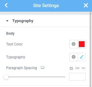
Within the Typography Settings you will find a ‘Paragraph Spacing’ Option. This is appears to be set to .9rem by default. Adjust this settings if you want more or less space between Paragraphs by default.
Within the Typography Settings you will find a ‘Paragraph Spacing’ Option. This is appears to be set to .9rem by default. Adjust this settings if you want more or less space between Paragraphs by default.
Within the Typography Settings you will find a ‘Paragraph Spacing’ Option. This is appears to be set to .9rem by default. Adjust this settings if you want more or less space between Paragraphs by default.
Form Widget (H4)
All Headings Again - Remember to check default Line Heights of Headings and Paragraph Text (H1)
Which Paragraph Text in-between (p)
All Headings Again - Remember to check default Line Heights of Headings and Paragraph Text (H2)
Which Paragraph Text in-between (p)
All Headings Again - Remember to check default Line Heights of Headings and Paragraph Text (H3)
Which Paragraph Text in-between (p)
All Headings Again - Remember to check default Line Heights of Headings and Paragraph Text (H4)
Which Paragraph Text in-between (p)
All Headings Again - Remember to check default Line Heights of Headings and Paragraph Text (H5)
Which Paragraph Text in-between (p)
All Headings Again - Remember to check default Line Heights of Headings and Paragraph Text (H6)
Which Paragraph Text in-between (p)

